case study · product design
I designed the UX/UI for turning predefined energy offers into a clear online buying experience — from landing pages and offer presentation to invoice upload, checkout and online signing.
- 83k+sessions
- 78k+unique users
- 3k+contracts signed
- 80%+mobile
For scale: in 2023, the year before this went live, Poland recorded roughly 6,000 electricity supplier switches across the entire market. Switching was a rare thing for anyone to do.
- Role
- Product design · UX/UI · Marketing
- Timeframe
- 2023–2026
- Segments
- B2C / SME / B2B
- Team
- In-house, with dev + marketing
the challenge
At launch the market was shaped by government price freezes. Many suppliers were communicating very similar electricity rates, which weakened the lever the category normally competes on: price.
People also struggled with what they were buying. Many had trouble with basic concepts like kWh, found their own bill hard to read, and didn't know which parts of the cost a supplier actually controls. Switching felt risky and slow, and probably not worth the bother.
How do you sell a product people don't understand, when price barely separates you from anyone else?
what the data kept saying
Whatever the offer was, it had to land in seconds, on a small screen, before anyone scrolled far enough to reach the reasoning. That constraint drove most of what follows.
decisions that shaped it
Fewer decisions on the page
What I assumed
The offer itself wasn't easy to present. It combined three tariffs (G11, G12, G12w) with contract lengths of 1, 2, 3, 5 and 10 years, which meant fifteen possible offers. More choice options or configurability should have felt like more control.
What actually happened
It didn't. Extra choice gave people load rather than control. Users came in wanting three answers: what will I pay, how long am I safe for, and is this better than what I have now. Most users didn't even want to understand the topic - they just wanted to be sure that we're reliable and the price is fair.
What I changed
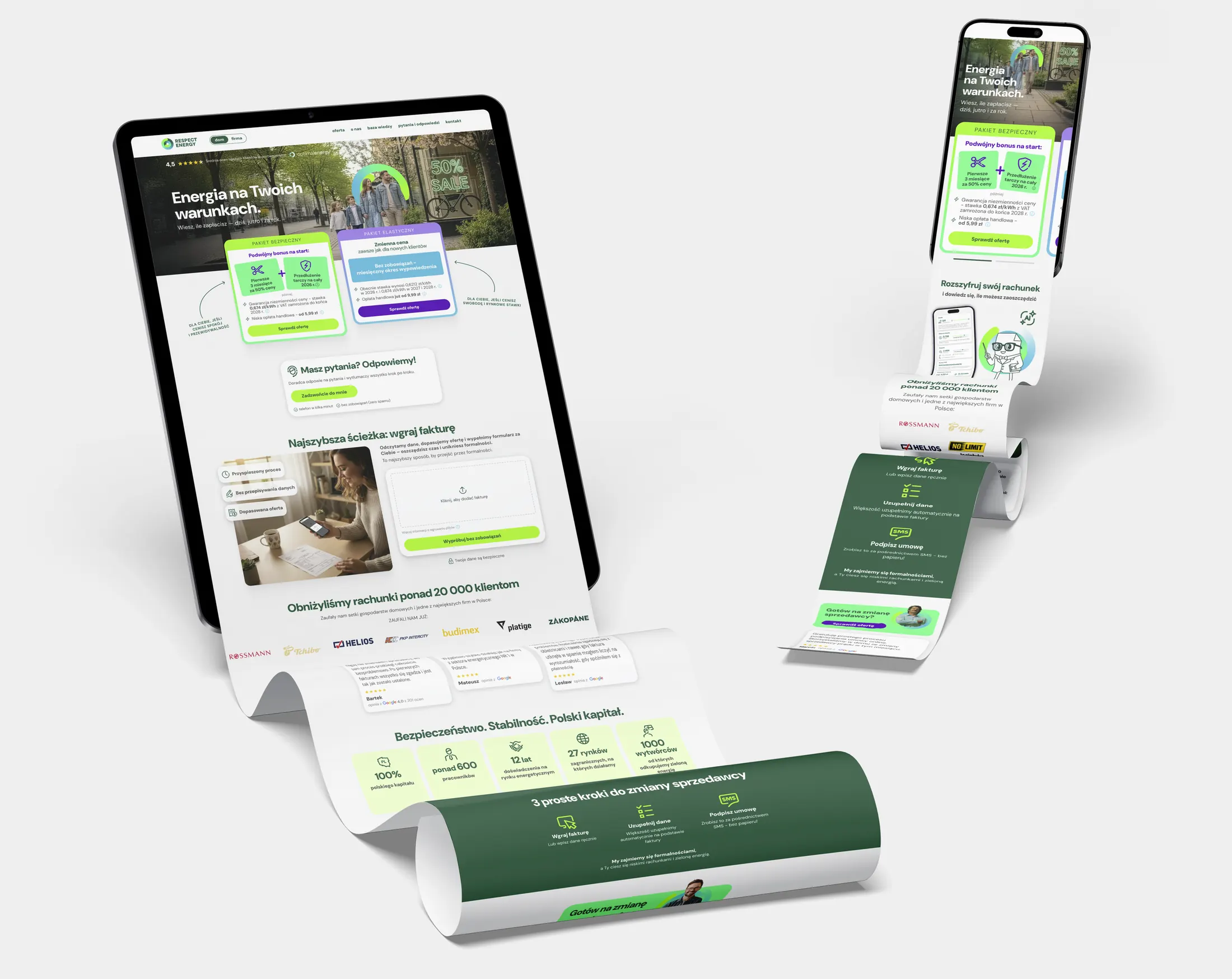
The first homepage narrowed to the three most popular offers in a carousel. A few months in after some user interviews, the flow moved to a configurator. The two-package model came later after long discussions with the offer team. I redesigned the presentation around the difference users actually cared about: safety or flexibility. Simplicity was the key - we ended up signing up around 100 contracts monthly.
How I translated the evolving offer into the interface:
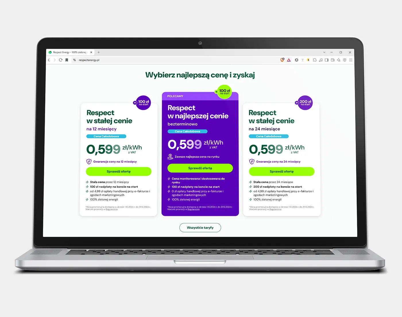
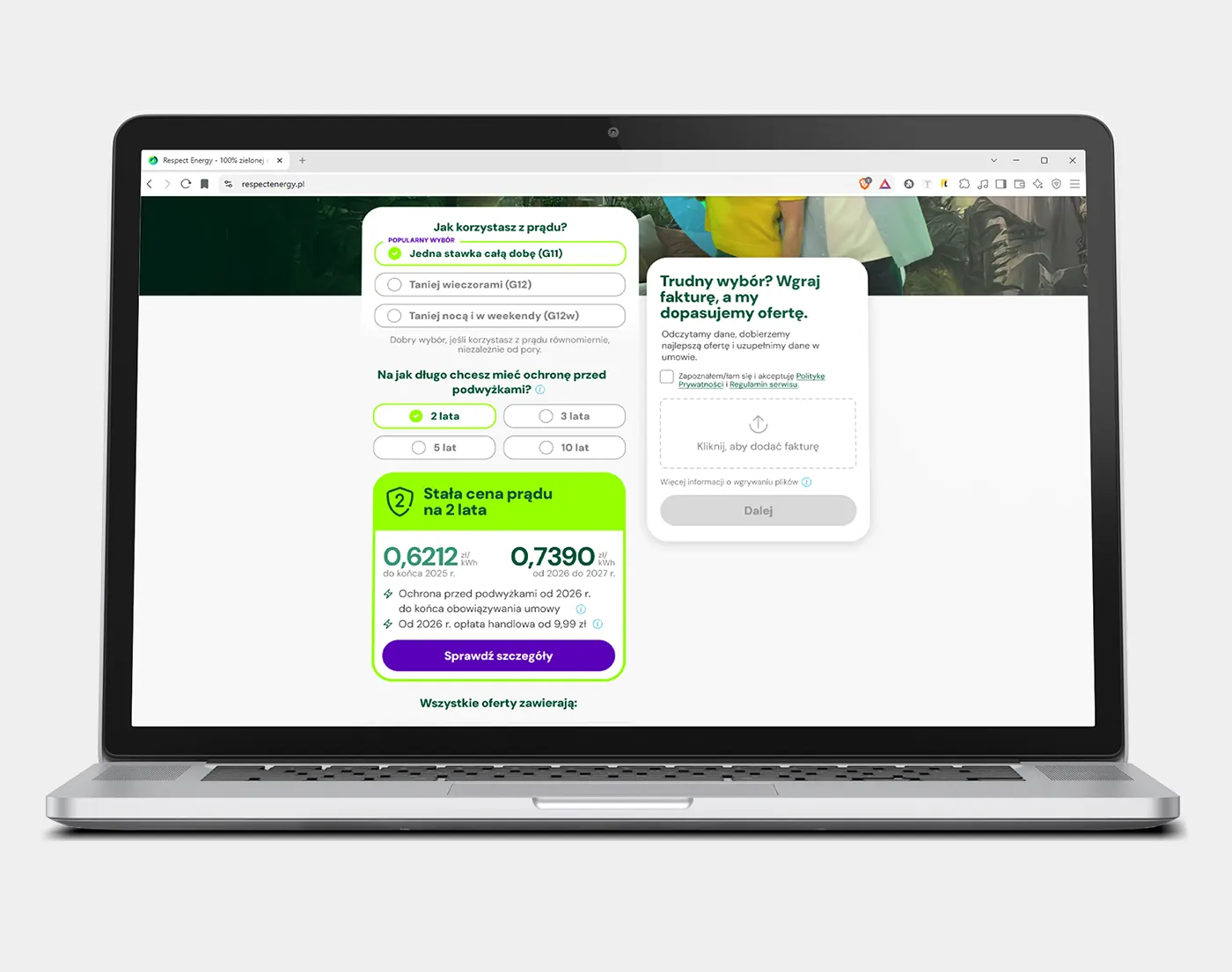
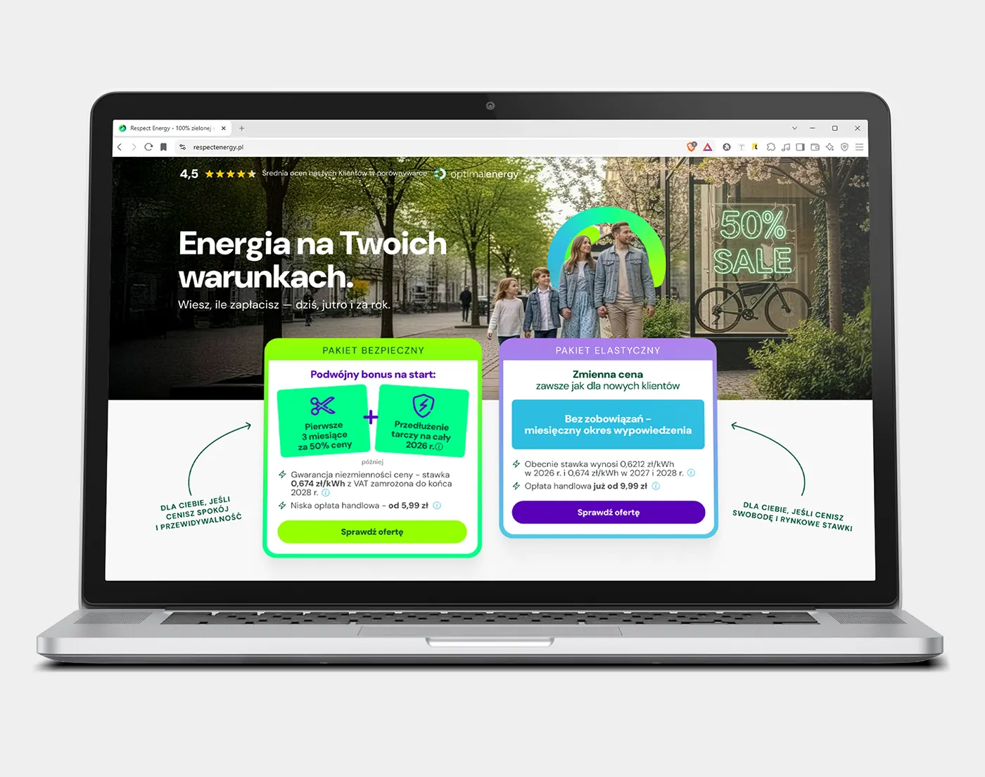
After the two-package presentation went live, around 90% of users chose the Safe package. The safety framing matched how people were already thinking about the decision.
Getting someone to find their bill
Key factor
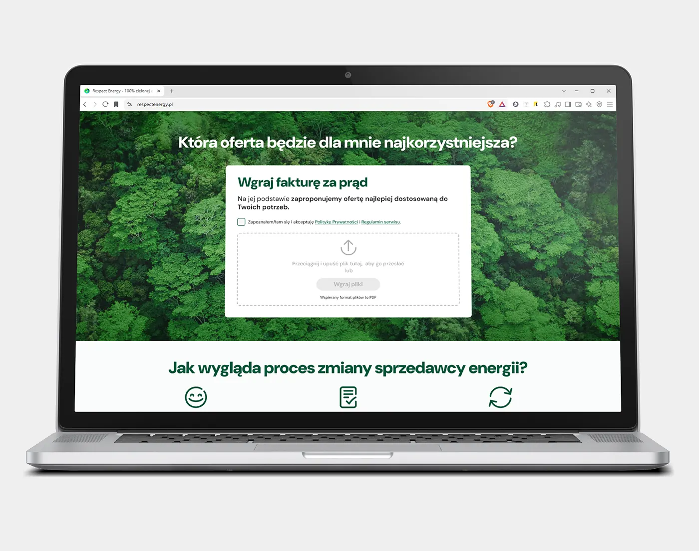
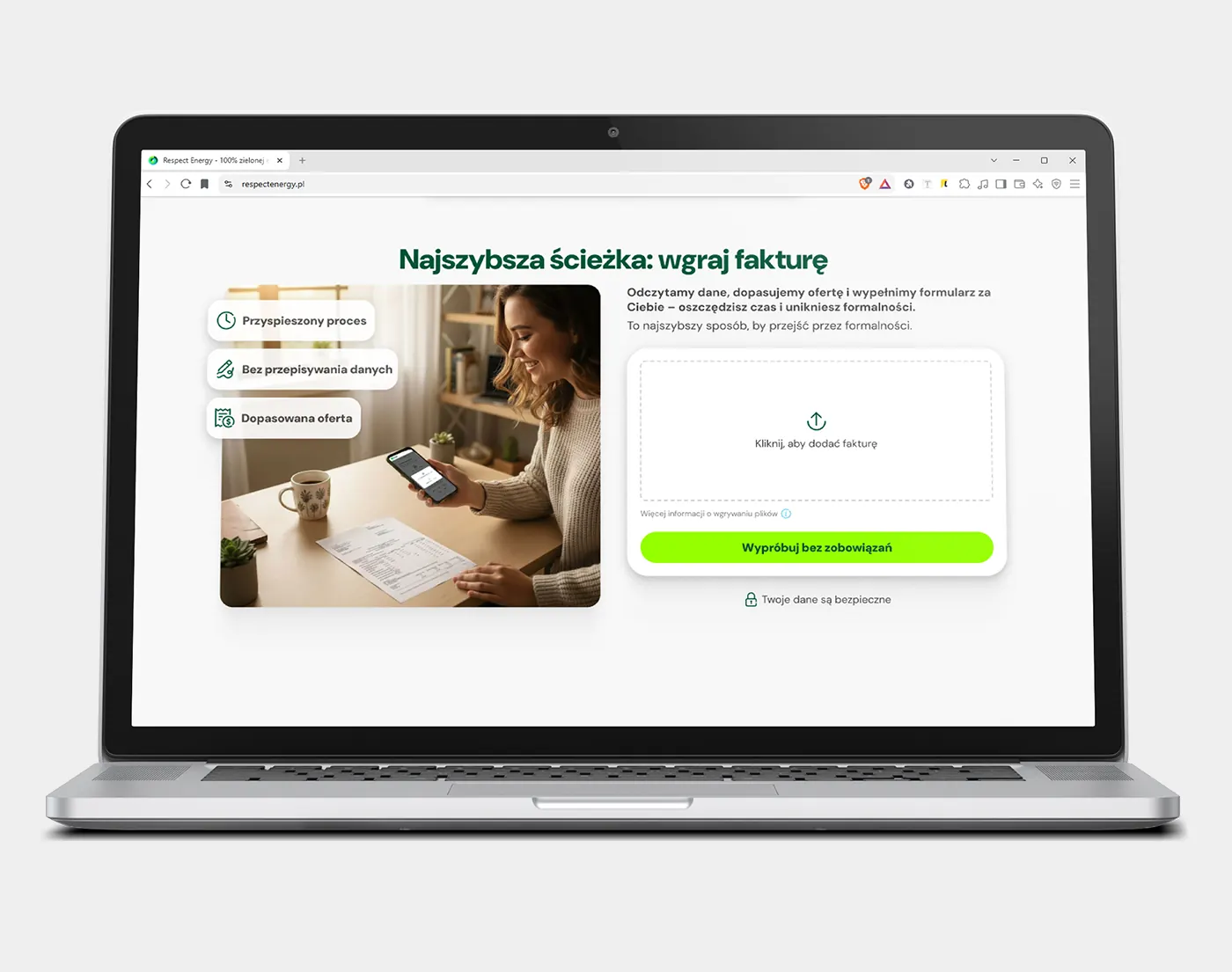
The electricity bill was both the biggest source of confusion and the best source of data. Upload it and everything downstream gets easier: read the data, match the offer, prefill the form. The OCR system was rough at first but once the AI engine was implemented it worked smoothly and almost error-free.
The challenge
The hard part was persuading someone to go and find and upload their bill. Our first ask on the homepage was too modest to be worth the trouble. Explaining more did not fix it either, because nobody read a long pitch. It ended up as three bullets: short enough to scan, specific enough to be worth it.
Final version
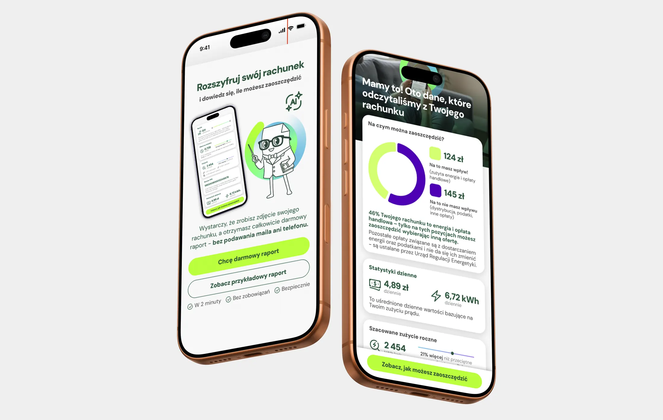
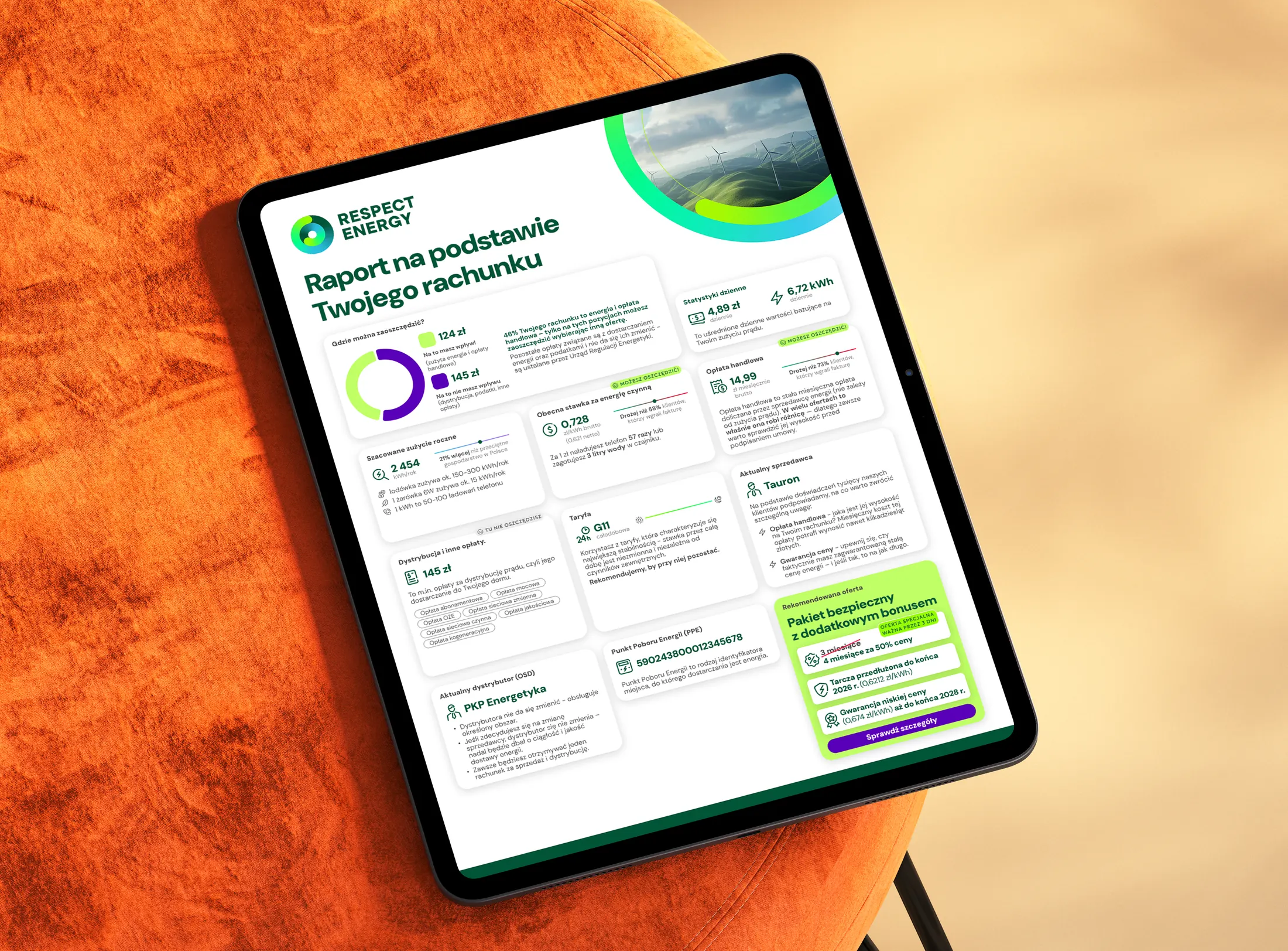
The invoice was the shortcut through the whole process: invoice → data confirmation → prefilled form → faster signature. We developed a system for generating personalized reports based on data read from the invoice, but unfortunately it never reached production.
How the OCR module changed along the way:
Trust first, then speed
What I assumed
People wanted this over with quickly, so speed was the thing to sell. Keep the switch short, keep the form small, and say how fast it is. At first I focused on clarifying the process and making forms as clean and understandable as possible.
What actually happened
A fast, hard-selling page was not the answer. Before reaching any stage of forms I designed, people had to believe the switch was safe. They expected to have to think hard about it, and a common worry was dealing with a lot of paperwork or even the risk of ending up with no electricity for a month. Respect Energy had sold to businesses for years but it was a no-name in the B2C market. What the page had to get across came down to this: you are safe, this is a supplier you can trust, the process is simple, and you need nothing but your bill.
What I changed
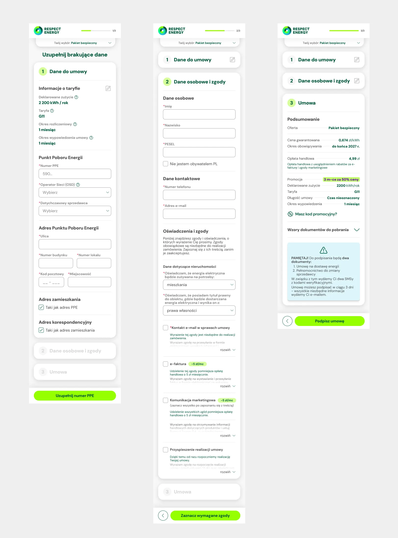
So the flow had to argue two things: this is quick, and nothing bad happens after you sign. Someone who had already decided could finish in a few minutes, sign online via Autenti, an e-signature provider, with SMS confirmation. Around it: simplified forms, steps ordered the way people think about the switch, data prefilled from the invoice, consents in readable language and a clean summary with no data hidden in the contract.
Once the user chose an offer and uploaded their invoice, it took three steps to sign the contract via SMS:
the homepage had to sell in seconds
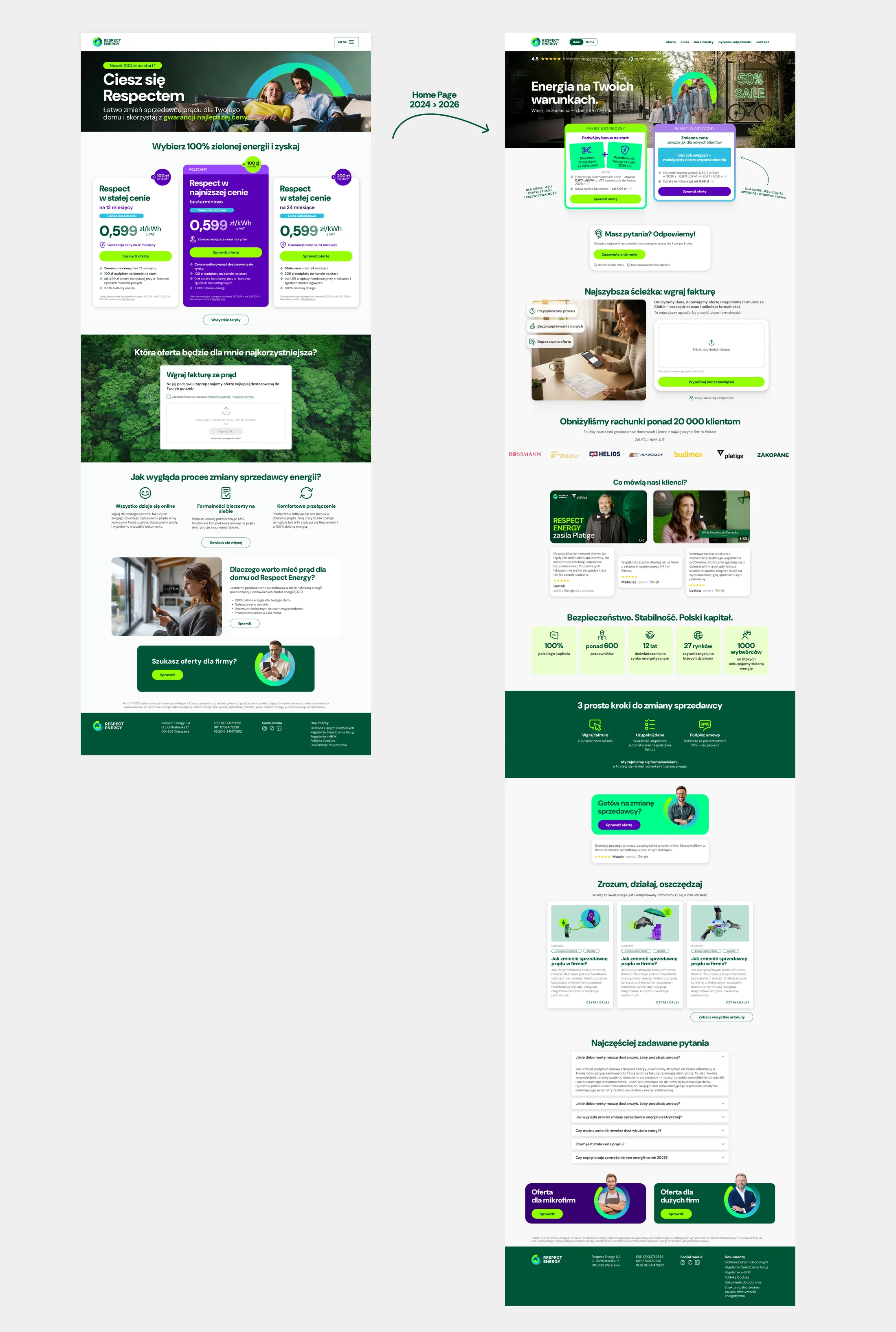
The first version pushed the offer quickly. In a category people distrust, that wasn't enough. Users also needed to understand who the company was, how switching works, what would happen after clicking, and what Respect Energy would handle for them. The page grew into something that explains and educates after implementing testimonials, a blog, an FAQ, etc.
how it changed year by year
- 2024
Launch
Went live with a wide range of tariff-based offer variants and a sales-heavy landing page. Price freezes meant most suppliers were communicating very similar rates.
- 2025
Simplify + explain
Configurator for engaged users. Invoice upload promoted properly for the first time. Landing rebuilt around trust and explanation rather than pure offer push. We introduced a whole new online funnel for SME customers.
- 2026
Two packages + AI
The offer department moved to two packages and I rebuilt the presentation around them. OCR moved from template-matching to AI recognition, which made photographing a bill on a phone viable.
Mid-2026, the B2C project was paused. The online channel now serves SME customers only.
impact
working with AI
For most of the time I was the single in-house designer behind these projects - AI was a second opinion I had on hand all the way through. I used it to critique designs, to argue back on decisions I was too close to, and to widen the set of options when my own had run out.
It did production work too: drafting scenarios for user research, and making graphics and headlines for the marketing campaigns.
what I'd still fix
Mid-funnel recovery was the biggest remaining opportunity. Many users who started an order did not come back to it. That made reminders, clearer progress recovery and abandoned-cart communication more valuable than another feature at the top of the funnel.
The bill report is the one I'd take to release. It's the one thing that would really stand out and give people a reason to upload their bill at all. The upload itself already proved that: once someone was convinced it was worth the effort, they finished the flow far more often.
my role
B2C ecommerce was the core of the job, but I was responsible for more areas.
- Owned
- Product design for the ecommerce experience: offer presentation, design system creation & maintance, package comparison, the selection flow, UI, forms, cart, invoice upload, the OCR-driven shortcuts, research prototypes, and support through implementation and testing.
- Not mine
- The commercial terms. Rates, kWh thresholds, bonuses and package mechanics were owned by pricing and business teams. My job was to make those inputs understandable and actionable in the interface. Where an offer direction was hard to explain or added friction, I could suggest changes.
- The company site
- Prior to the ecommerce platform, my task was a full redesign of respect.energy, the company's own website. From then on I kept design consistent across the wider digital ecosystem.
- The microbusiness flow
- Built the ecommerce process for eligible microbusinesses too. Business buyers expect to negotiate rather than accept a fixed price, so the pricing team set the boundaries and I turned them into an interaction: a base rate, a rate you could suggest, and an automatic counter-offer where the rules allowed one. It stayed a side stream. B2C was the main focus and where the sales happened.
- Marketing and acquisition
- Designed the campaigns that brought the traffic in, along with their landing pages, creative and the messaging angles tested across audience segments. Designing both the ad and the page it led to kept the two saying the same thing.
- Brand hero
- Proposed and designed a brand character for a category that is usually dry and compared on price alone. It came from my side rather than from a brief, and it gave the communication a warmer voice to speak in.
- Documents and legal
- Maintained the document templates the flow generates and took them through legal. The consent screen was settled in those same conversations.
- Consents
- Drafted the marketing consents and cut each to the shortest version legal would accept. The rest sits behind a summary line, so the screen stays light.
- Proposing the work
- Most of those changes started on my side rather than as requests to me, from consent wording to the improvements that went into each release.